WAKE UP
THE IDEA.
Wake Up started with a question: what does a coffee brand look like when you can also order from it? I wanted to carry one idea through the whole route, from the first look at the cup to the last tap before checkout.
THE IDENTITY.
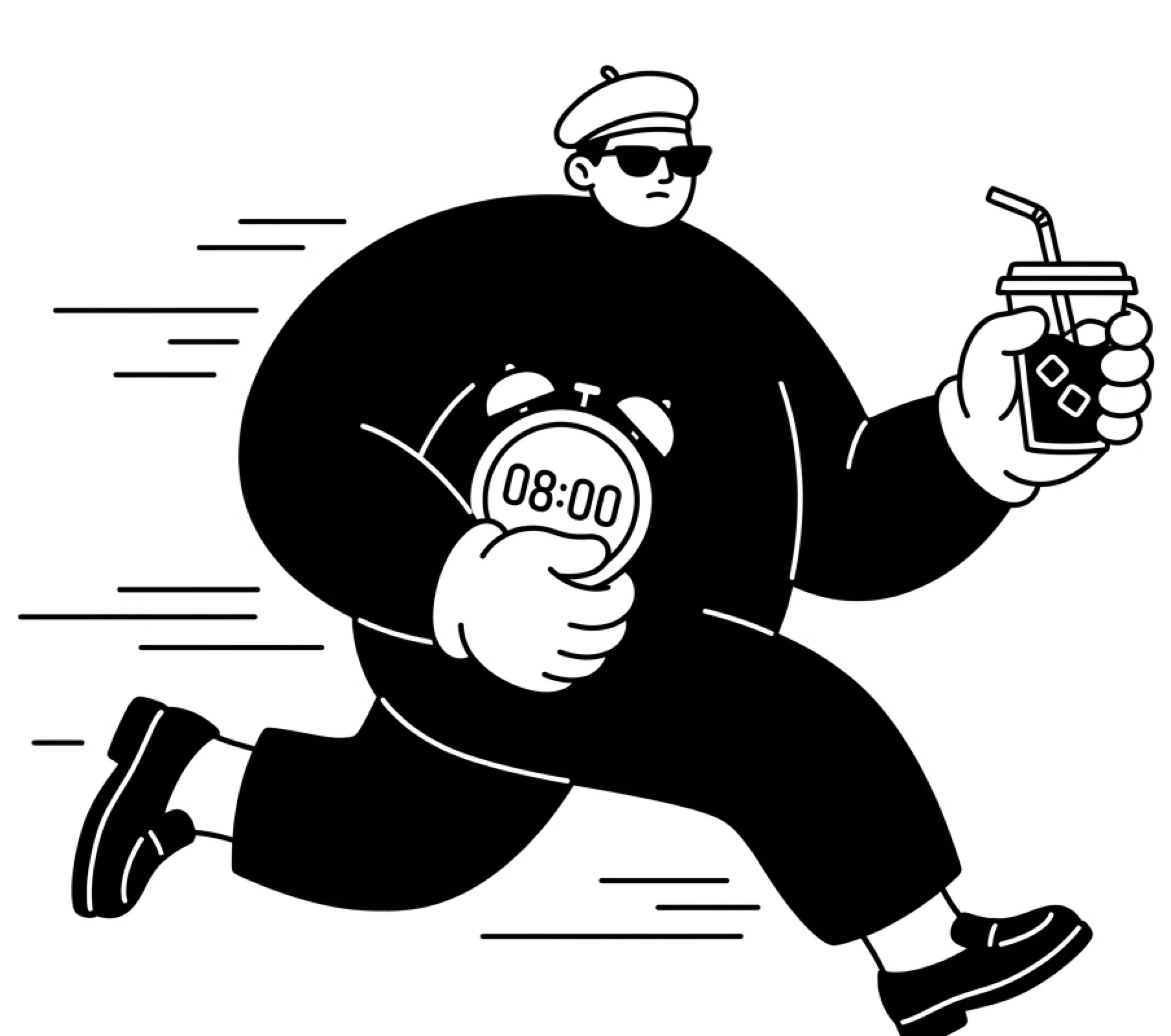
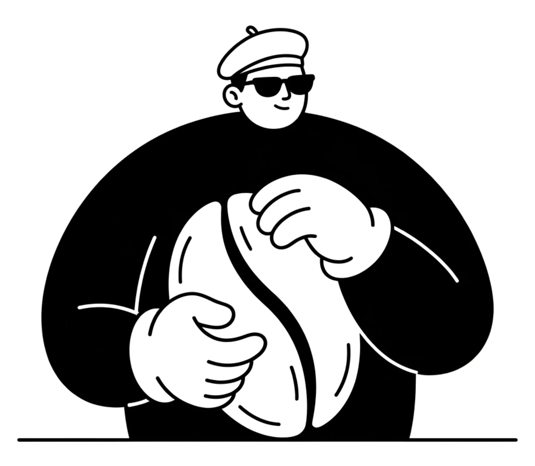
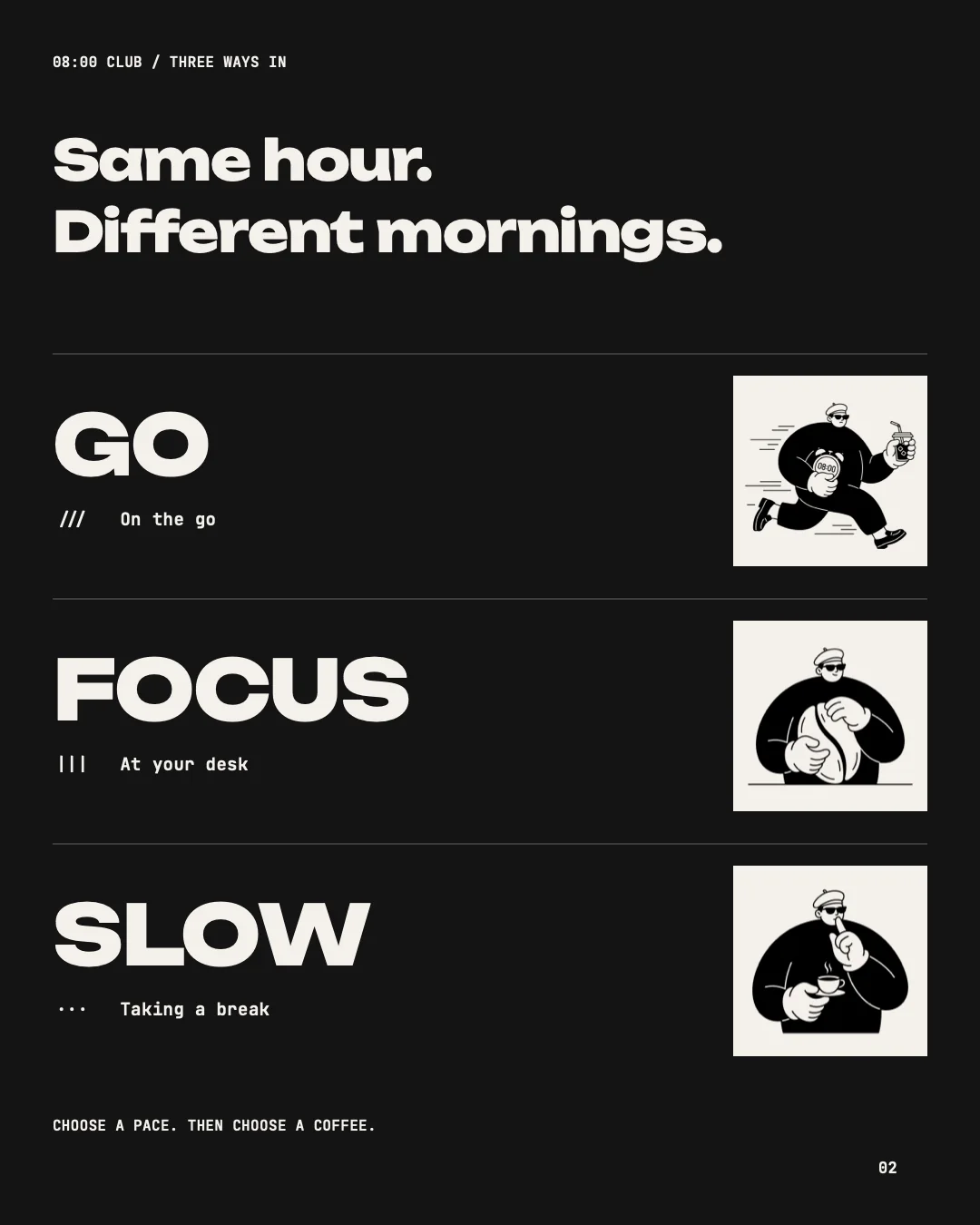
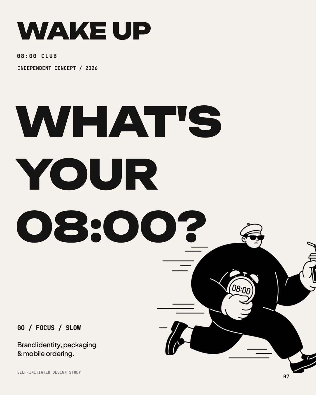
The morning has three rhythms: GO, FOCUS and SLOW. Each one has its own character on the packaging and its own selection of drinks in the app. The palette stays black, white and warm paper, so the characters do the talking.

Unbounded for headlines, Plus Jakarta Sans for text, JetBrains Mono for details such as tickets and labels.
PACKAGING.
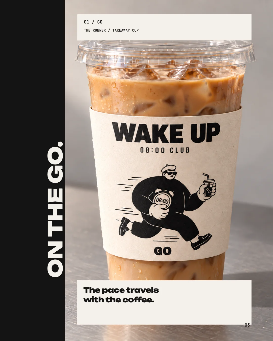
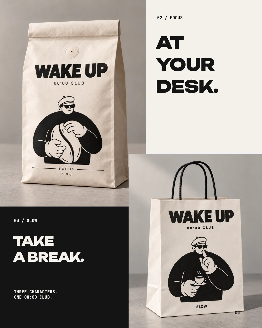
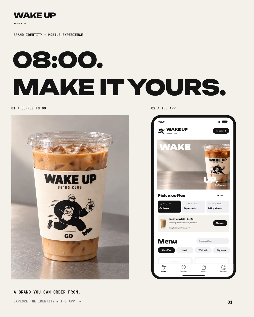
The cup sleeve, the coffee bag and the paper bag carry the same characters, so the pace travels with the coffee. A drink in your hand tells you which morning it belongs to.
THE APP.
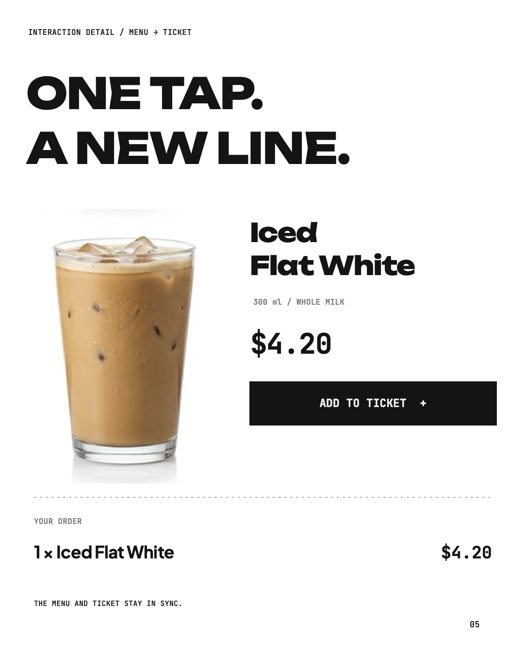
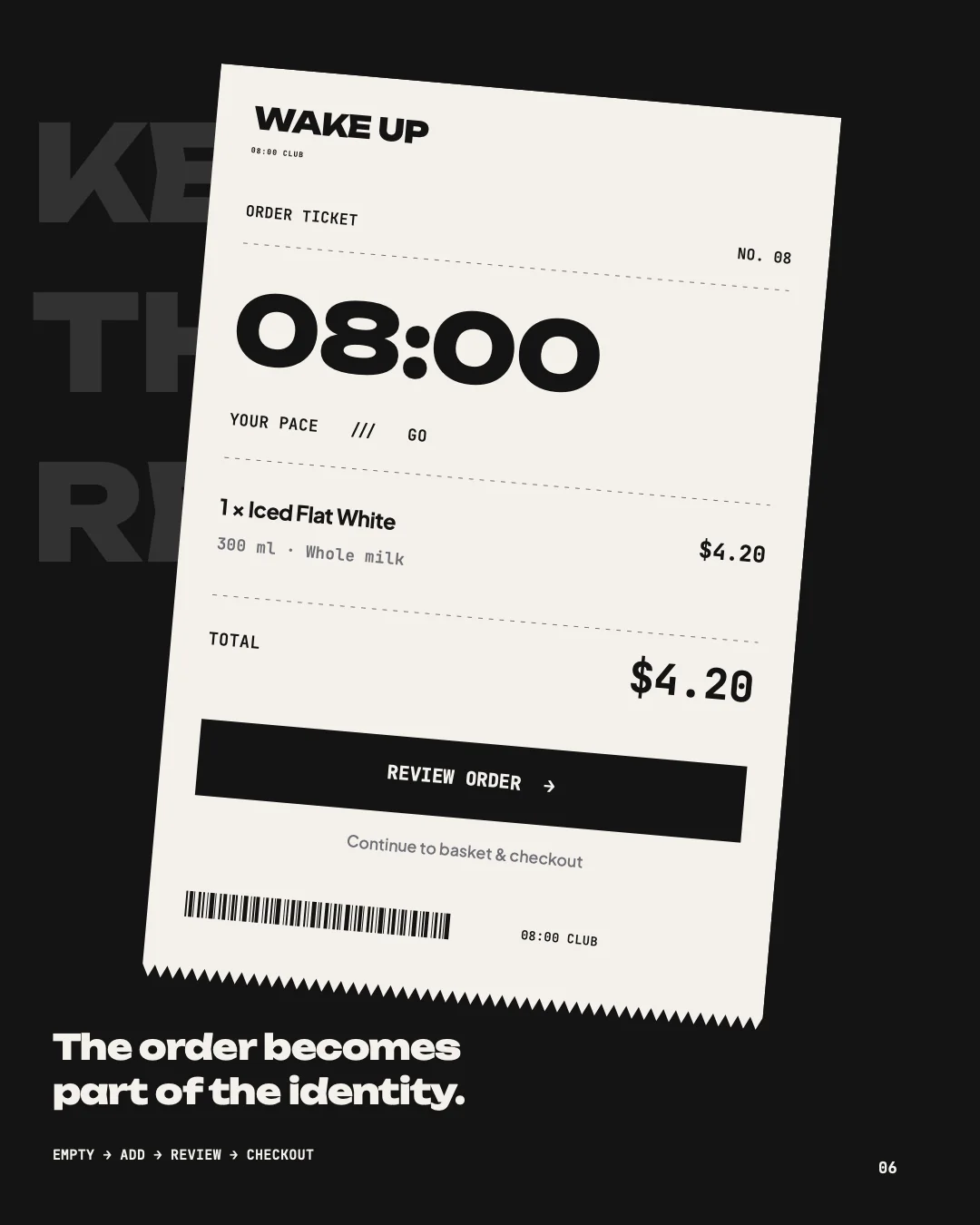
In the app you pick a coffee and milk, see your order as a ticket under the menu, and go on to the basket. The reel follows that route: the home screen, the menu, the Iced Flat White card, oat milk, adding it to the order, the ticket and My Basket.
- Pick a coffee
- Choose milk
- Add to the ticket
- Review the order
The reel is a motion presentation of the interface. The screens were rebuilt and animated from the HTML prototype; it is not a screen recording of a working app, and no real payment is shown.
FOR INSTAGRAM.
I presented the project as a seven-slide carousel, 1080 × 1350, with the reel next to it. The slides are in English, the captions I wrote in Russian.
ONE ROUTE.
The characters sit on the cup, in the bag and on the ticket, and the app answers the same question as the packaging: which morning is this?
LET’S TALK.
Have a place or a product you want to bring to life? Tell me about it in the brief.